Simply Beautiful Townhouse and Condo Makeover
Well guys, it’s been another fun past year with makeovers and I’ve concluded 2018 with some very cool projects in partnership with HomeSense Canada.
Last summer, my son Cory and my daughter-in-law Daniella purchased their first home which just happens to be directly across from my office. This was totally THE BEST as I could easily drop by anytime to bring over any decor and furniture items they needed to complete the look they were going for in this amazing space.
Two key areas in their home that I focused on were the kitchen and guest bedroom. Let’s talk about how they turned out and what my kids wanted to see on their “mood board”.
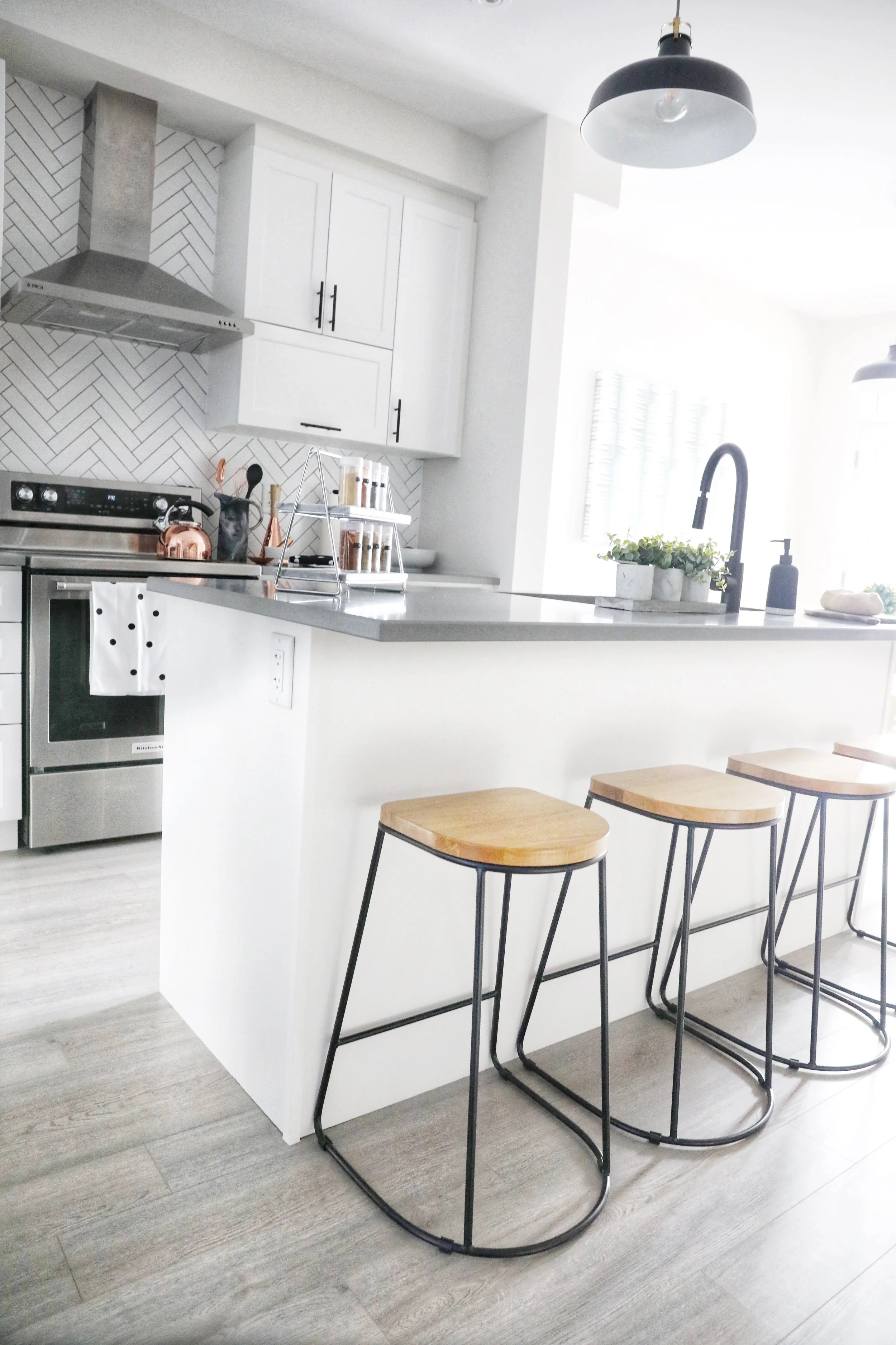
Daniella really wanted a mix of clean lines mixed with modern and vintage vibes. She chose to go with a minimalist black and white theme for the kitchen cabinets, hardware and lighting. With this type of palate, the sky really was the limit for decor items. In keeping with the clean look, I picked out decor items that would flow with the room and colours that would warm up the simple black and white background.
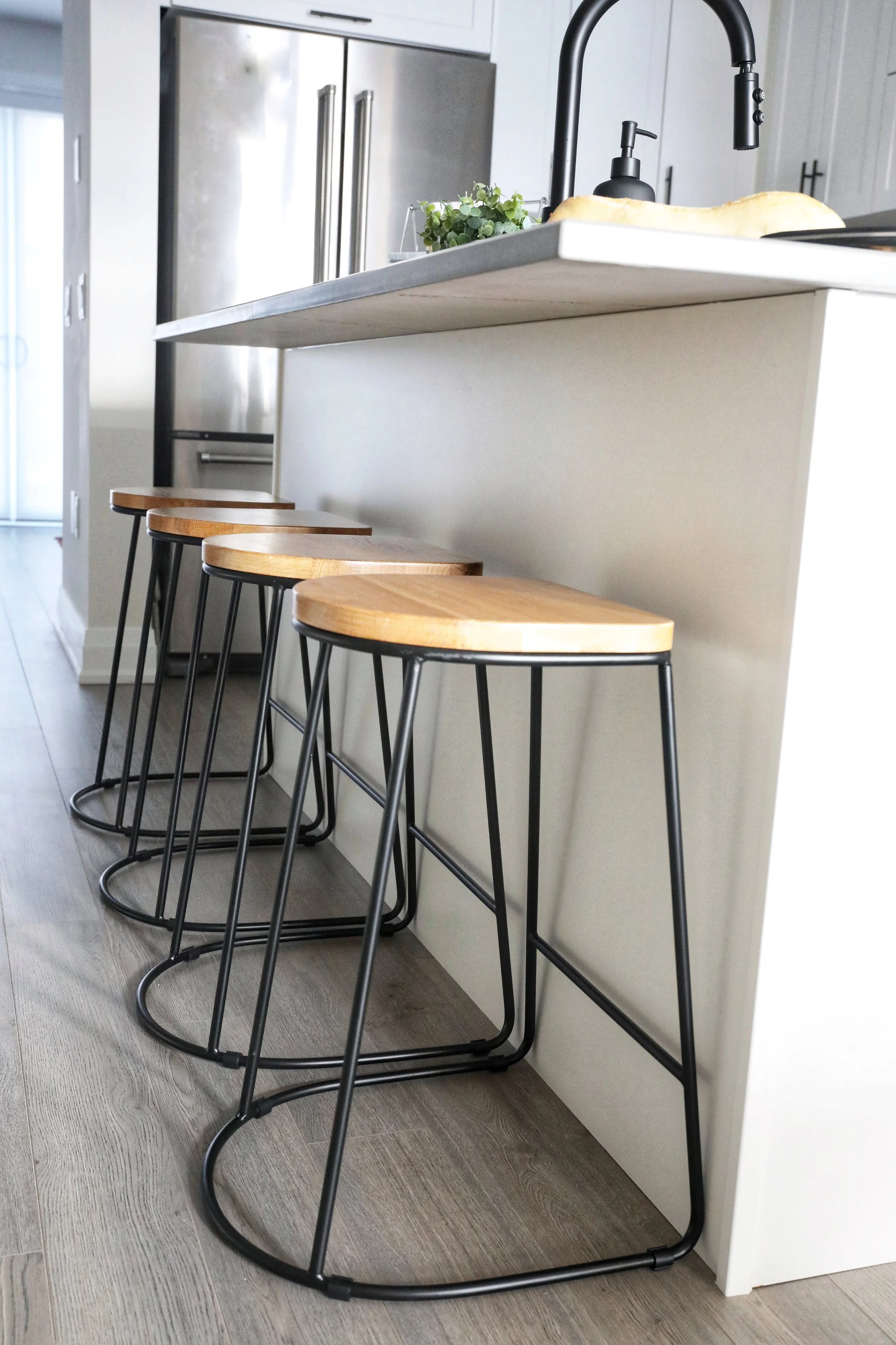
By adding in these beautiful bar stools, the wood seats lent warmth to the island while still blending into the theme with their black iron base.
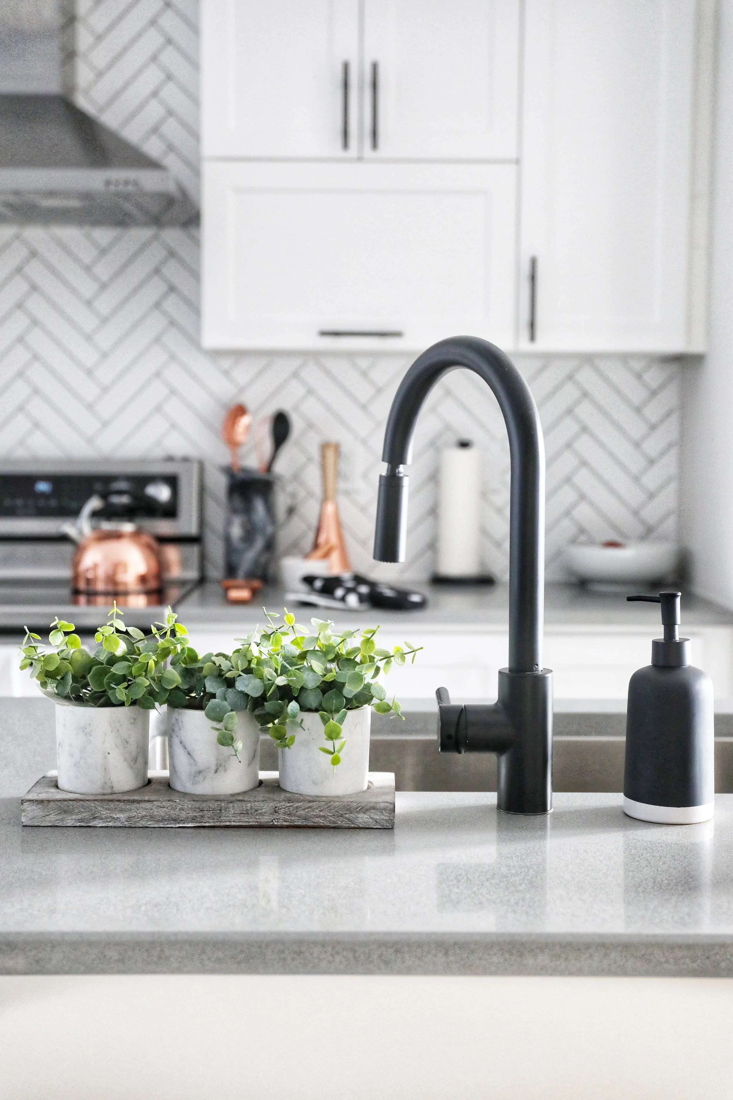
For the island itself, adding in a bit of greenery is always a great idea. This carefree faux plant trio was the perfect accent piece to place near the sink area.
As well, I choose to have a two tiered stand to display spices and keep it in a handy spot for easy reach while preparing recipes.
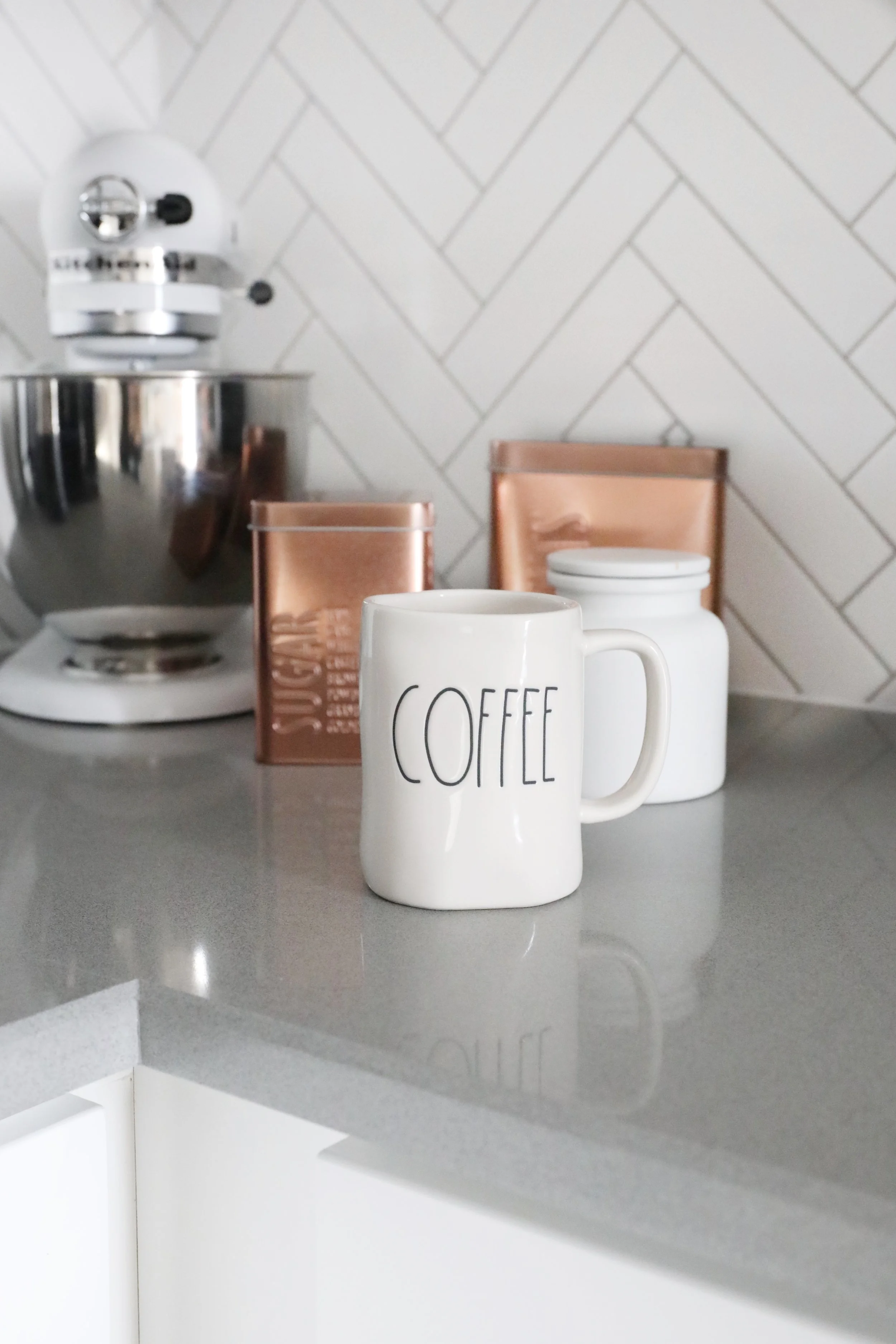
Rounding out the look, I threw in pops of copper in the accent pieces the counters such as jars, utensils and that gorgeous tea kettle. Designer hand towels in a cute polka dot pattern were a must to add a little fun into the decor mix.
Ellie (their dog) approved the whole look once we were finished and actually matches perfectly with the colour of the bar stools.
Moving up to the guest bedroom, Daniella had always loved the idea of going with a rich wall colour in a dark hue of green. I think she nailed it with this choice.
From the moment you walk in, it feels warm and inviting yet dramatic and serene. The accent palate for this room was hunter green, black,white, yellow and pink.
I’m loving the way the decor items look here. Check out this multi-coloured throw and the beautiful pillow and bedding I scored at HomeSense Canada.
The side table was also a fab find along with the small decor items and a signature rug that just tied everything together.
After completing these two rooms in the townhouse, it was time to tackle a larger project of mine in a new condominium unit. This beautiful space is now being rented by my youngest son Jesse and his girlfriend Jenna.
For this space, Jenna asked for a soft colour palate in heather grey, blush pink and white. Keep in mind, my son has never in his life had anything close to blush pink near him so this was going to be a “hard sell”.
There were three spaces that I worked on for this condo makeover. The kitchen, living room and master bathroom. The areas were so great to work within because of the amount of space allotted. And the views from the 19th floor are so spectacular that quite honestly, it was easy to get sidetracked and peer out of the massive windows overlooking the downtown skyline.
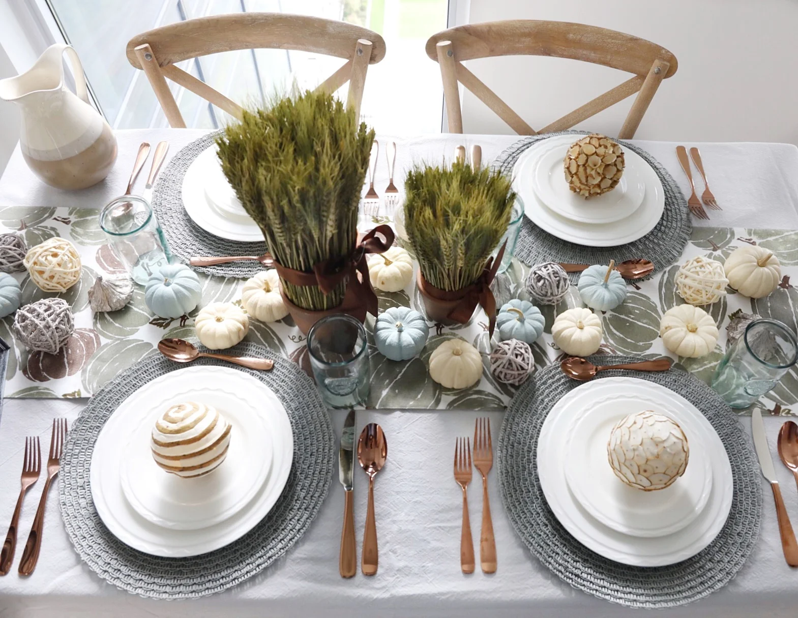
Starting with the kitchen area, I photographed this for a Fall inspired shoot in October. I fell in love with the kitchen chairs as soon as I spotted them at HomeSense Canada. They were a mix of reclaimed wood and fabric in the exact shade that Jenna was in love with. The style and comfort of the chair was a perfect fit for this condo kitchen space.
As well, I found so many amazing decor items to pop out the island and counter areas. From soap dispensers to kitchen decor items, everything came together perfectly and the result was so pretty.
The next area I tackled was the master bathroom which was very small is size.
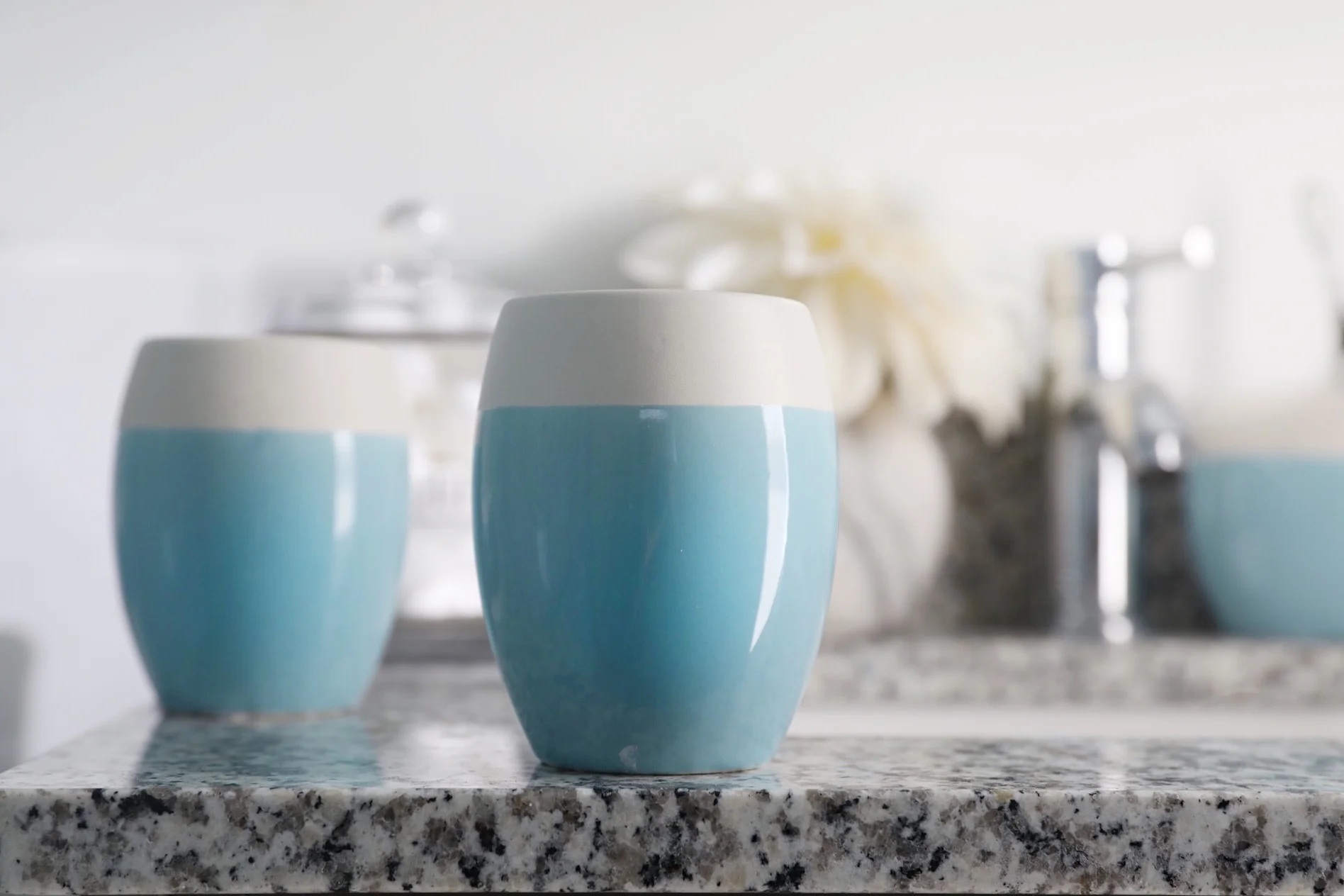
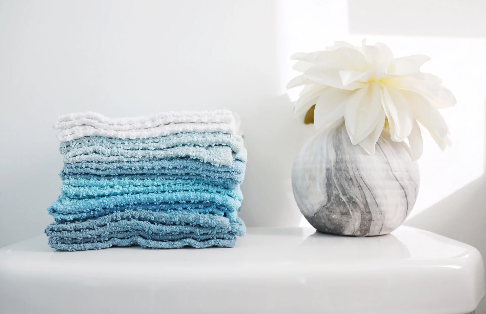
In here, we decided to add in a colour pop of different shades of turquoise to offset the dull look of the light brown cabinetry.
I absolutely love the mix of turquoise and brown together.
In fact, I use that colour combo in so many of my food photographs! Take a look at how great the decor items and linens look in this tiny bathroom. LOVE!
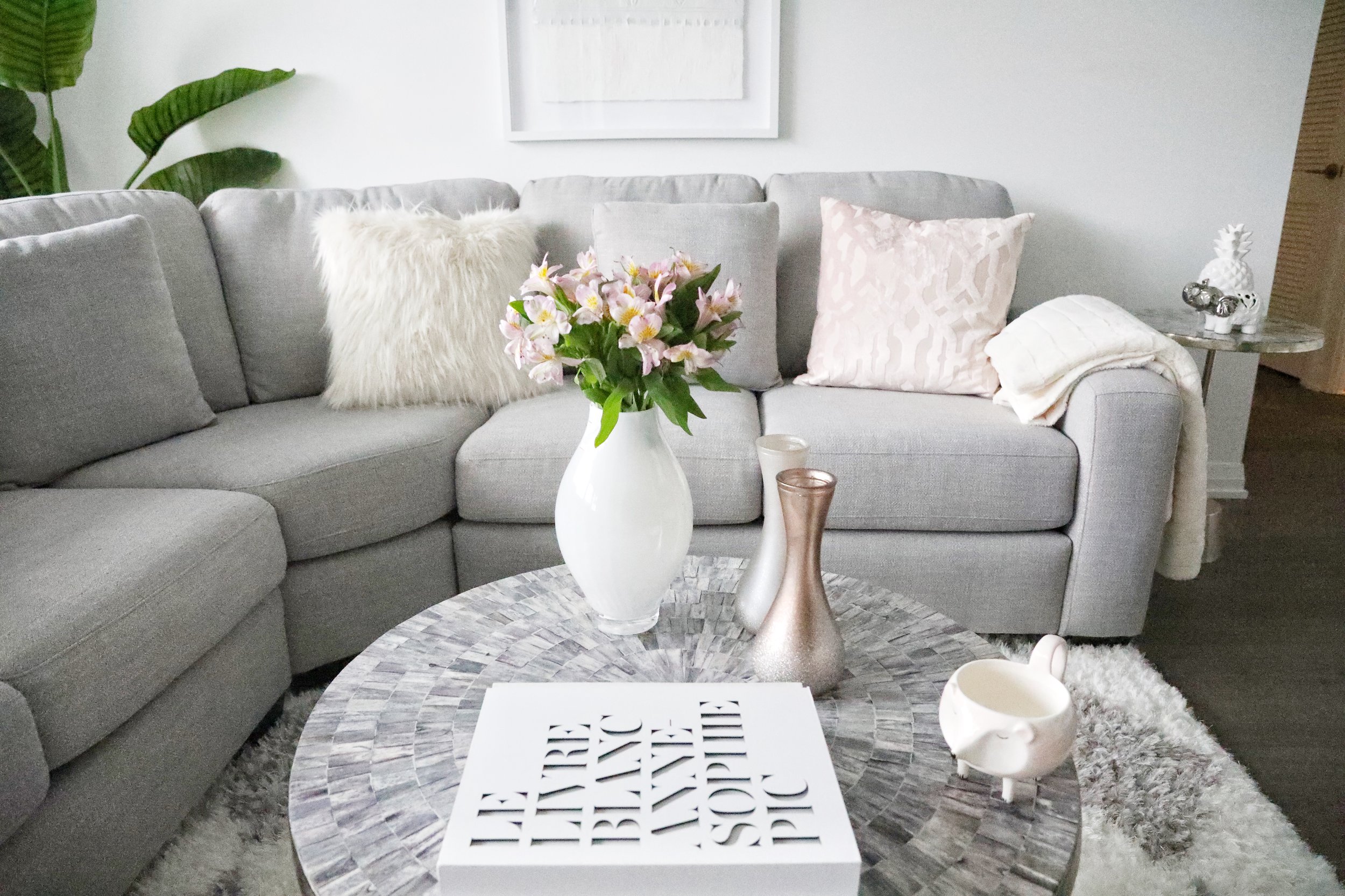
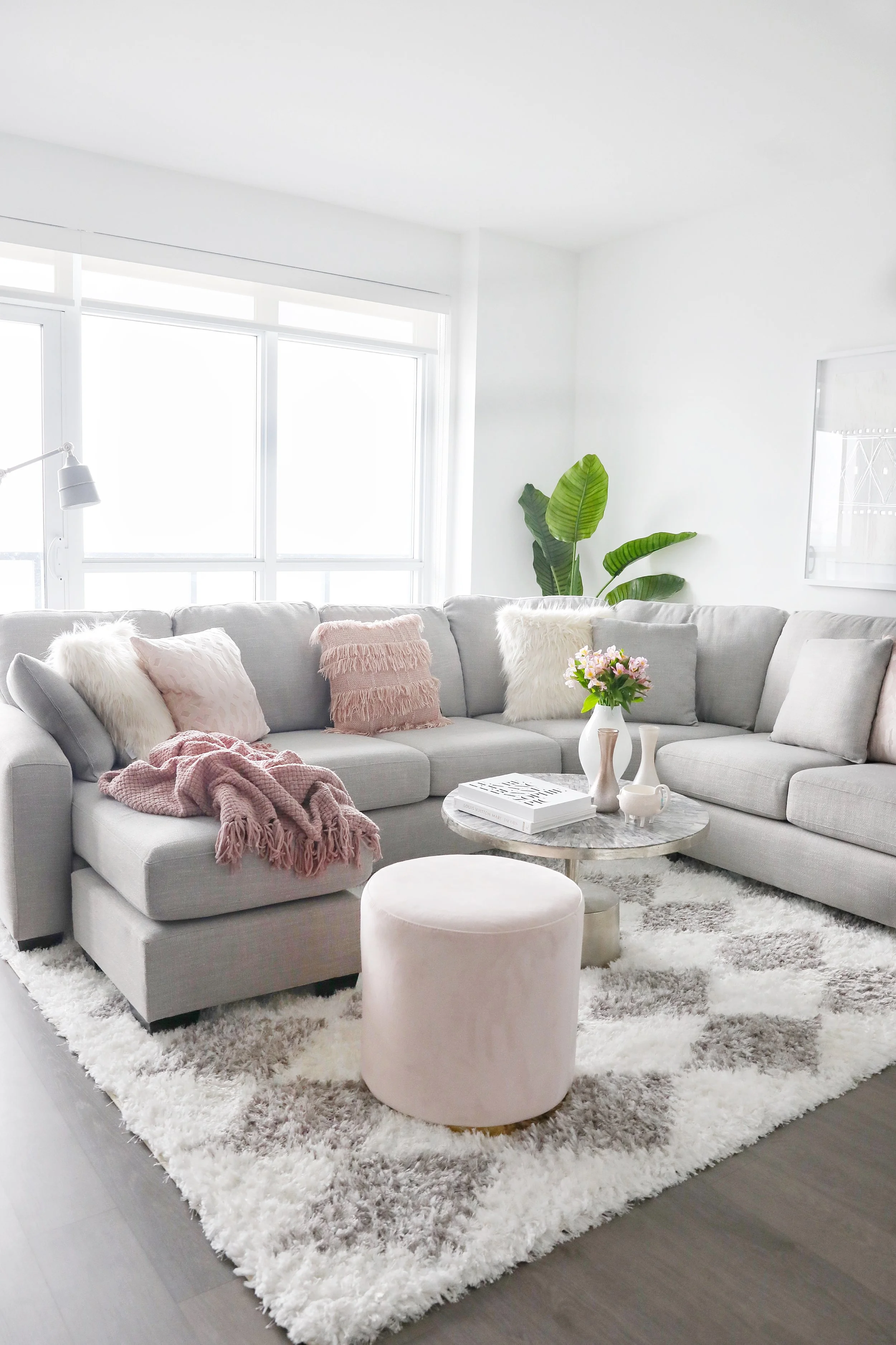
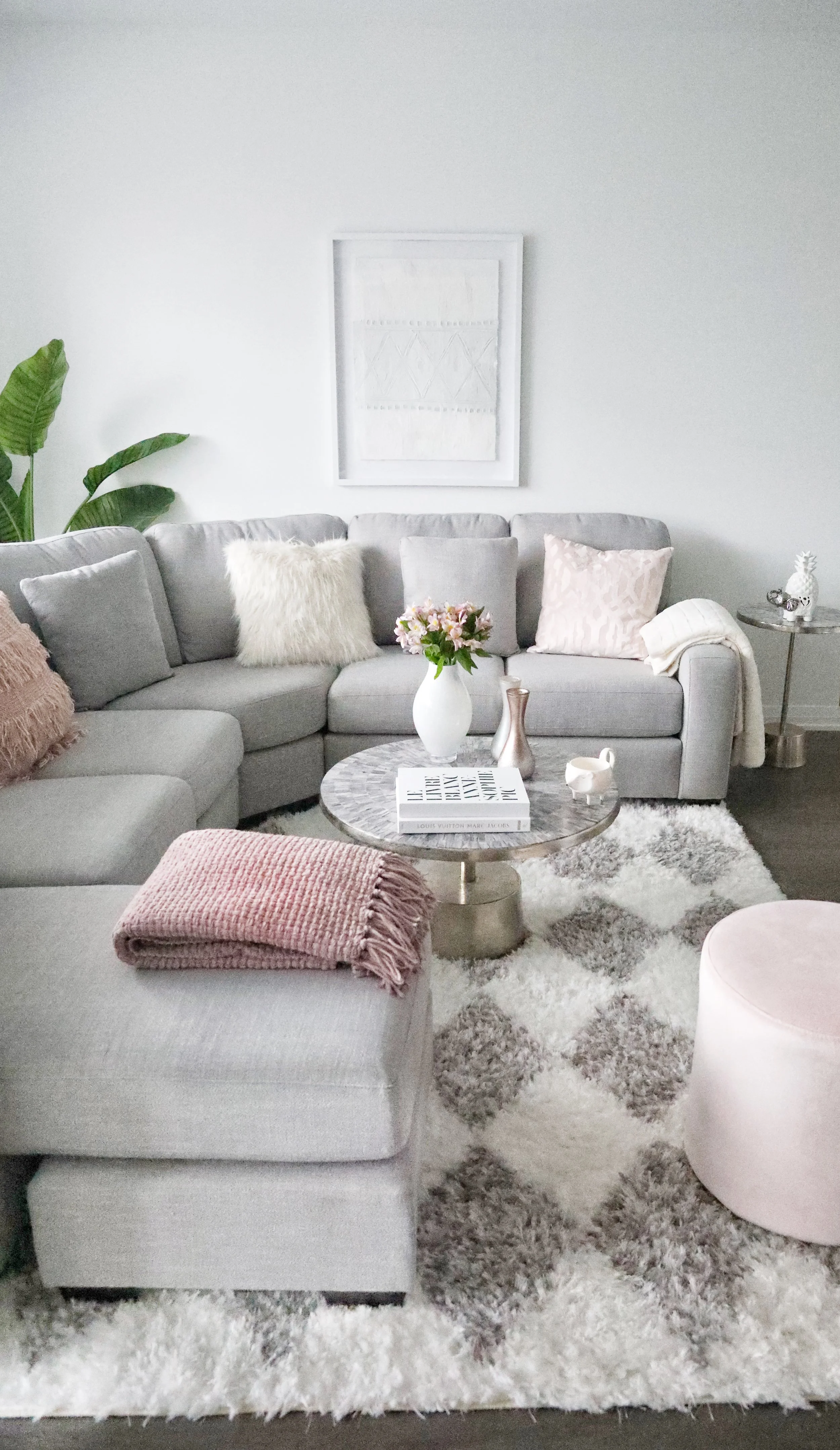
Last but not least, the living room area. This is one room that needed a lot of coverage as it was so spacious. A custom made sofa in heather grey was the key focal point here and I’m so happy that it filled the area so well.
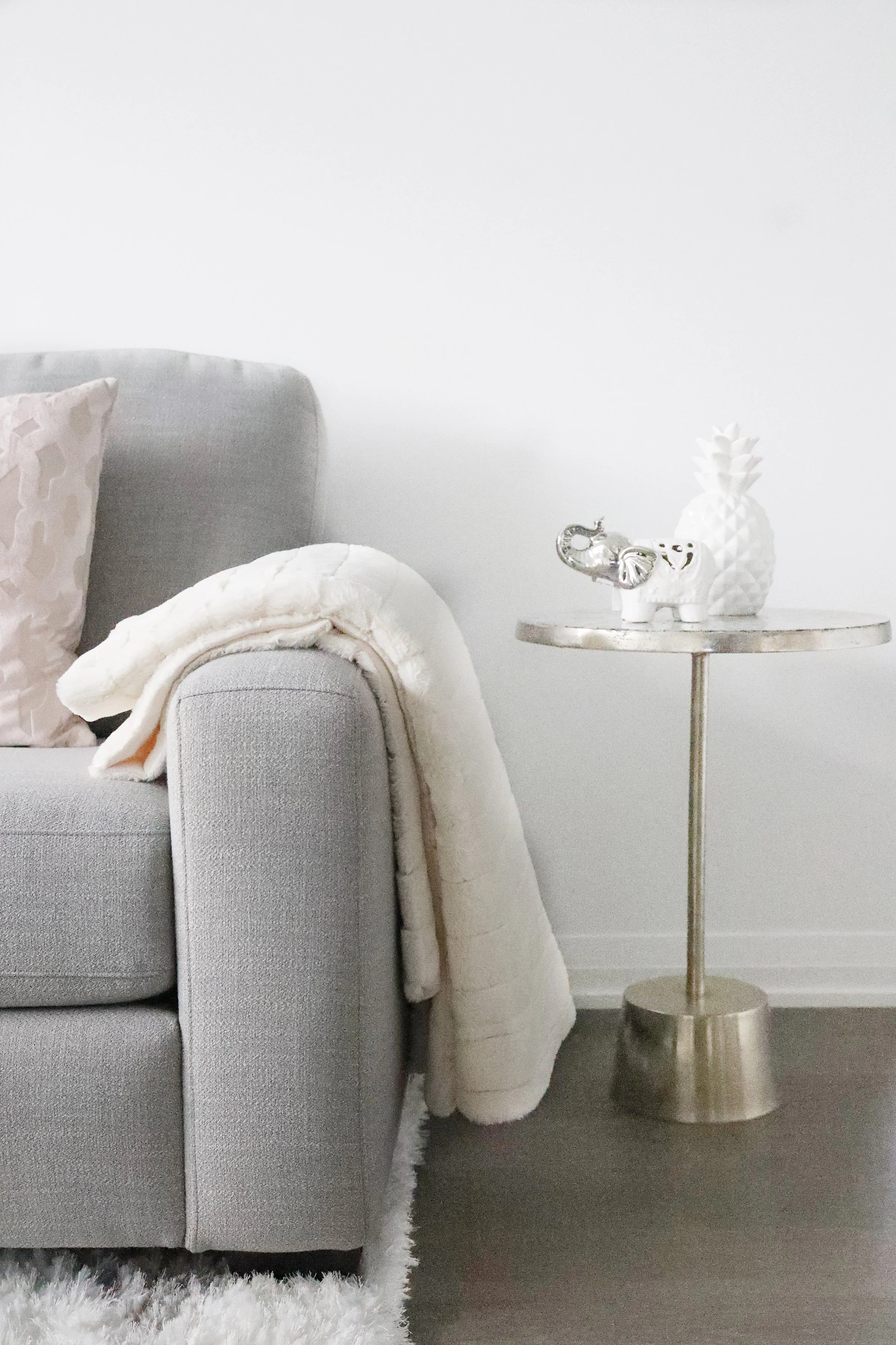
Now it was time to add in all the decor items. I found two incredible tables that were a perfect fit for the area. I placed the larger one in front of the sofa and the smaller one to the side.
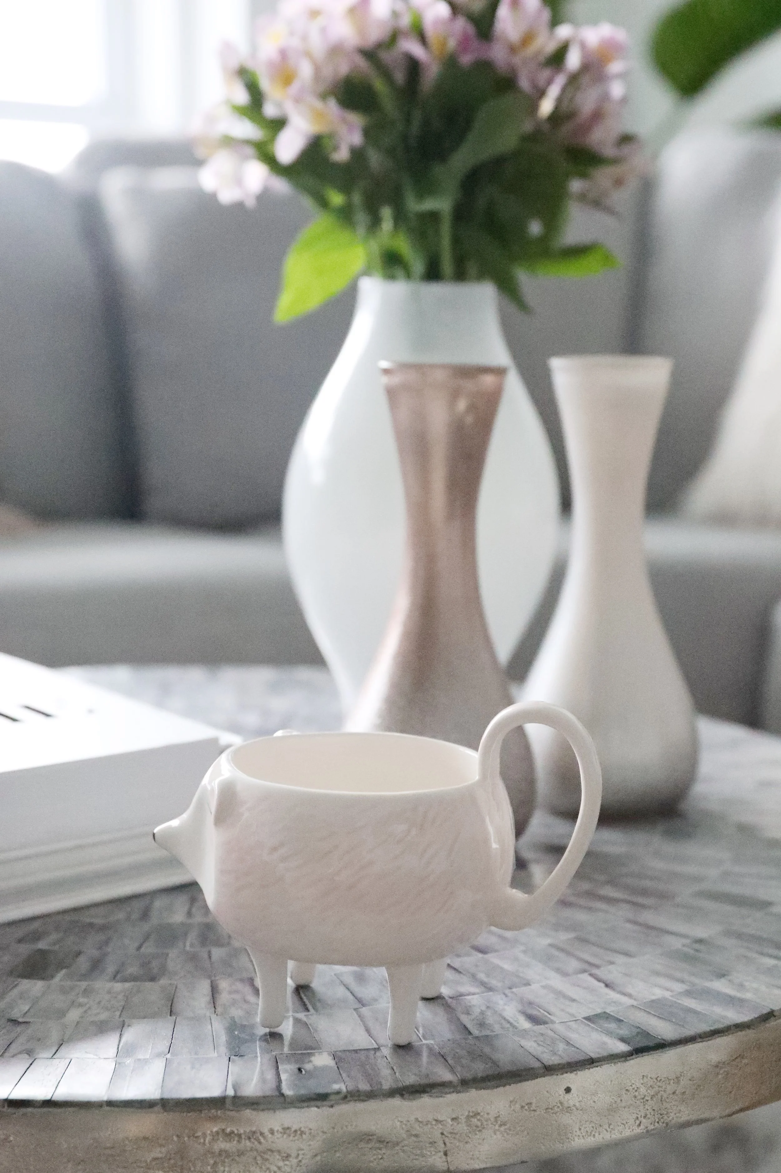
One of my favourite things to shop for is small decor items and these were so adorable for both tables.
Rounding out the room were the incredible pillows, throws and this unreal accent rug. Come on with this!
And to top it all off – the famous BLUSH PINK POUF. When Jenna and I found it, we actually squealed with joy. The only concern we had of course was how to get it past Jesse. I mean, it’s pink for godsakes.
Do you want to know how he reacted? It’s literally his favourite thing in the room. Go figure.
All in all, these two journeys were just simply beautiful. Hope you enjoyed it!


